So a good friend of mine is a personal trainer and he was in need of some kind of commercial for his social networks. something to provide his potential clients with a look and feel of his training and information on where to contact him if needed. so i spent a couple hours of my time filming one of his MMA workouts and put together a few 15 second clips for him to share on sites like instagram, Facebook, and twitter. I made them short for 1.) instagram only lets you record 15 seconds of video to post. and 2.) people attention span on social media is short to none so we need to get them drawn in and tell them what it is quick before the swipe down and forget your post. So here they are. take a look and i hope you enjoy.
Here is a Logo i did for Arcadia High School, They Needed something strong and bold but something that everybody could wear. They're colors are Red and blue, but i didn't want to be cliche with it so i went with a navy blue shirt and a simple white text for the design. The school has been around since 1959 and obviously have some history with it and i wanted the design to represent that as well. Strong, Bold, and rustic is the look i wanted to portray in the design for the school. But at the same time keep it cool and simple that way everyone would be inclined to wear /buy it.


To create the graphics for your template, you can use any of your own creations or obtain permission from designers that make digital clipart or any other digital designs. I like to use digital scrapbook kits. In my sidebar are listed the digital designers that I have used for my free designs. I have permission to use their designs because I have paid the commercial license fees they required. If you find a design on the web, make sure that you check the designer's terms of use and/or email the designer to verify their permission for you to use their designs. This is especially true if you have a commercial blog and/or make any income from your blog.
Once you have graphics for your template design, you need to decide what graphics editing program you will use. I recommend either Photoshop Elements or Pixlr.com. If you are fine with a simple design, Pixlr is the way to go. If you want something more detailed, I would use something better like Photoshop Elements.
Once you have graphics for your template design, you need to decide what graphics editing program you will use. I recommend either Photoshop Elements or Pixlr.com. If you are fine with a simple design, Pixlr is the way to go. If you want something more detailed, I would use something better like Photoshop Elements.
1. BACKUP YOUR CURRENT TEMPLATE!
This tutorial can get complicated. If you make any mistakes, I am not liable, so backup your template before you do anything to your blog. Another good idea is to create an additional blog that you can practice on. That way, if anything goes wrong, your practice blog will be affected, but your real blog won't be ruined. Once you create your perfect template, you can download the HTML from the practice blog and then upload it to the blog you actually use.
2. CREATE A REPEATABLE BACKGROUND

To make this design, I cropped an image from a digital scrapbook kit that. This image will be tiled across the background of your blog so that it covers the entire screen. This type of background is best because the file size of this image can be very small. A small image size means that when a reader opens your blog, the background of your design will load very quickly. More intricate background designs can get very large and slow down the computers of your readers.
3. CREATE A HEADER, POST/SIDEBAR BACKGROUND AND FOOTER
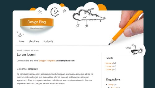
This type of design requires a specific type of header. This is a great example of a header below:

Notice that the header has the post/sidebar background attached to the bottom of it. This is necessary to give it the continuous look. Also, notice that the background behind the title is transparent. It is not white, it is transparent.
Carolynn at Makin' Cute Blogs has posted a video tutorial on how to make a similar design. She offers a video tutorial using Pixlr. The last video shows how to make the post/sidebar background. Here is her tutorial:
4. CHANGE YOUR BLOG TEMPLATE TO THE WHITE SIMPLETEMPLATE
This tutorial is based on the Blogger Simple template. There are 7 Simple Templates. Choose the last one, the one that is all white.
To choose this template, choose Template from the drop-down menu on your Blogger Dashboard. On this page, you will several templates listed at the bottom. Find the last Simple template and place your cursor over the image. You should see the words "Apply to Blog / Customize". Click "Apply to Blog".
5. ALTER THE HTML/CSS
Now it is time to add to and alter the HTML/CSS of your template to fit each of these design elements.
A. First, we are going to add some CSS:
i. Go to the Template page and click "Customize" so that you are in the Template Designer.
ii. Click "Advanced" from the menu on the left and then scroll down in the second menu until you see "Add CSS".
iii. Add the following code into the box:
.header {
width: 1040px;
}
.content-inner {
background: url('POST/SIDEBAR BACKGROUND DIRECT LINK HERE') repeat-y;
background-color:transparent;
background-position: 7px;
background-position: 7px;
padding-bottom:10px;
padding-left:40px;
padding-right:40px;
padding-top:10px;
width: 960px;
}
.footer-inner {
background: url('POST/SIDEBAR BACKGROUND DIRECT LINK HERE') repeat-y;
background-position: 7px bottom;
width: 960px;
}
.footer-outer {
background: url('FOOTER IMAGE DIRECT LINK HERE');
background-repeat: no-repeat;
background-position: 0px bottom;
border: 0px;
padding-bottom:160px;
width: 1040px;
}
B. Now we are going to alter the HTML.
i. Go to the Template page and click "Edit HTML". (You may want to backup your blog again before editing the HTML, just to be safe.)
ii. The first change is to move the HTML for the Header outside of the "content-inner" section of the blog. This will set the header above the main portion of the blog and allow it to have a transparent background. To do this:
Find the HTML that starts with <header> and ends with </header>. (Use Ctrl-F to find this section.)
Cut this section and move it from here (right below <div class='content-inner'>:

To right below <div class='content-outer'> (Use Ctrl-F to find this section.):

iii. Now we are going to move the Footer section outside of the main body of the blog, just like we did the Header.
Find the HTML that starts with <footer> and ends with </footer>. (Use Ctrl-F to find this section.)
Cut this section and move it from here
Find the HTML that starts with <footer> and ends with </footer>. (Use Ctrl-F to find this section.)
Cut this section and move it from here
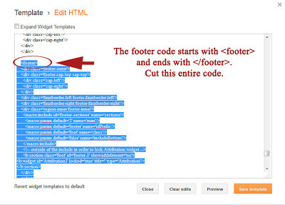
To right below
<!--content-->
</div>

This placed the footer section outside of the main section and allowed it to have a transparent background.
6. MAKE A FEW ADJUSTMENTS
After entering the code, you may find that your design elements do not line up as well as you would like. To do this, you alter the CSS code that you provided to make everything line up. It takes a lot of tweaking to get it right, but in the end you should end up with one continuous page without noticeable segments.
7. ADD EXTRA DESIGNS
The final step in creating your own custom template is adding extra design features such as a post icon, post divider, sidebar titles, blog button etc. There are several tutorials for these shown below:
Also, be sure to customize the fonts and colors on your blog in the Blogger Template Designer. Go to Advanced and then click on any of the options and use the fonts and colors that look best on your blog!
Thanks for using this tutorial. Leave a comment with a link to your blog. I'd love to see your custom designs!
- Krista Nelson
About 86 percent of people get
distracted when working. There’s a wide range of distractions, such as people
around you for example, television, and videos. It’s important to have a
productive workspace because it keeps you focused, which will over time improve
your productivity. Here are five tips on have to get rid of those distractions.
Tip
1: Have A Curved Screen.
A curved screen will keep you
appealed visually and also keep in absorbed in your current work.
Tip
2: Section Areas.
It’s wise to has a comfortable seat
but even wiser to have different areas you can go to and relax for a while. Get
away from the monitor for a few minutes to help you relax.
Tip
3: Decoration.
Decorate with some artwork or photos
you love. It should be something that inspires you. Tape it up on the walls and
whenever you feel blocked just focus on it. Let the images seep into your mind
and bring out your creativity.
Tip
4: Make Clutter Disappear.
A great thing to do is keep your area
clean. If there’s a mess then clean it right away. Try to stay organized. Another
thing to do is keep your amount of wires minimal.
Tip
5: Fragrance.
A good scent can keep you happy,
energized, and motivated. You’ll stay focused and productive. You could burn
some incense, spray perfume or cologne, or even light some scented candles.
Let’s recap shall we. Curved screen,
sectioned areas, decorations, non-existing clutter, and fragrance are what it
takes to have a productive work environment. With that in mind go out and see
which of these tips work for you.
Web design and
multimedia/web design seems like two sides of the same job and both have their
challenges and gratifications, and within this essay the two jobs will be
compared and contrasted to see how each will match up. A web designer designs
the graphics of a site or the site as a whole in hopes of selling the design(s)
to a company or corporation. These designs can be for one page or multiple and
must meet with the company or corporation’s ideas and requirements. A
multimedia/web designer deals with much the same thing as a regular web
designer, but they work on web development teams to create a more sophisticated
web site as a whole rather than just a few parts here and there. Both of these
very noteworthy jobs within the graphic and web design industry are responsible
for creating the most appealing visual design possible in their own unique
ways.

There are many similar
aspects between web designers and multimedia/web designers. Customarily, both
jobs are seen as one especially to those outside of the field. Normally, both
are responsible in combining the graphic, textual, and other elements of a site
to create a visually appealing layout. The web designer is responsible for as
little or as much of the layout that is given to them to appeal to the
audience, while multimedia/web designers work with a group to create a whole
interactive website. As web design author Steve Krug is quoted, “If there's one
thing you learn by working on a lot of different Web sites, it's that almost
any design idea--no matter how appallingly bad--can be made usable in the right
circumstances, with enough effort,” and it’s this quote that unifies the web
designers and multimedia designer as one.

There is, however, a huge
difference between a web designer and a multimedia/web designer. Web designers
as said above are generally only put in charge with as little or as much of
project assigned to them using the textual, graphical, and other elements of
the project, while a multimedia/web designers work in lager groups on the
project as a whole in a more dynamic and interactive way using motion graphics,
sound, and videos. Furthermore, web designers have the options of working
freelance and selling a non-functional designed page or site to whomever they
please, where as a multimedia/web designer relies on working within a group
within a company to take a non-functional design and making it a fully
functional website for other companies. There are many other differences
between the two positions, but one must understand, is that both jobs are just
as important and noteworthy for a project to be completed.
-Krista Nelson
- Don't make me think!: a common sense
approach to Web usability (2nd ed.). Berkeley, Calif: New Riders Pub..


